
Today we are going to talk about Responsive Images. Responsive Images are a very useful technique to make your designs look good regardless of the user’s resolution screen.
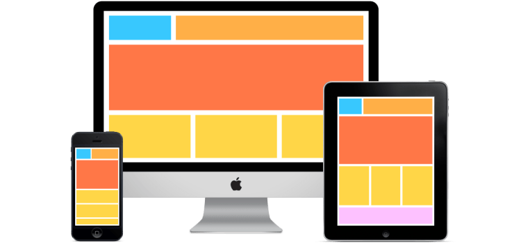
Nowadays when we create our online projects we want them to look good on every device. Desktop, Mobile Phones, Tablets, you name it.
With HTML you can use two different approaches to accomplish this and I will teach you how do implement it and how can you make it cross-browser and make it work with older browsers.
Why Responsive Images?
With responsive images, you can deliver the image with the best fit for your user’s screen. Why deliver a 5MB image when you can deliver a 3kb image for your user that is accessing your website on his phone? Your user will see your content faster, will navigate through your content faster, and will use a lot less bandwidth which will save you a few bucks.
- Faster navigation.
- Bandwidth savings.
- Most of us don’t live in a world where we don’t have to care about 4G data consumption.
The <picture> element
The syntax like this:
See the Pen Responsive Images for Responsive Designs #1 by Igor Escobar (@igorescobar) on CodePen.
Notice in this example I’ve used ImageBoss to crop the smart crop the original image for desktop, tables, and mobile phones. I’ve used it because I not only want to deliver images with proper sizes but they are also compressed and delivered with Progressive Scans.
Notice that you open the code pen above and resize your window the image will change accordingly to your window size.
The <img> element with srcset and sizes attribute
If you don’t like the approach above you can also use the <img> tag with the srcset and sizes attribute.
See the Pen Responsive Images for Responsive Designs #2 by Igor Escobar (@igorescobar) on CodePen.
https://static.codepen.io/assets/embed/ei.js
Browser Support
Notice that both the <picture> and <img> approach are only implemented on modern browsers as you can see in the image below:
 More Info: https://caniuse.com/#feat=picture
Cross-browser Responsive Images
If you are concerned about how this is going to work on an old browser you can use a very cool project called Picturefill. It will basically wrap the W3C specifications for img and picture with javascript to make it work.
How to generate multiple images for multiple screen sizes?
In this very post, I’ve used ImageBoss to generate the images for all the devices I wanted. I didn’t need to generate all of them by myself and also didn’t need to code anything specific for it. All I needed was to have my image stored somewhere and it did the heavy lifting.
Hope it helped!
 Igor Escobar
Hi Igor! Pleas, tell me, how I can escape zero in the input mask plugin?
LikeLike